these beautiful pens - Miss Elderberry
these beautiful pens by Miss Ederberry
Tuesday, September 2, 2014
Goodbyes: Sailor Susutake and a yellow Montegrappa Miya
Lately my approach on the Fountain Pen Accumulating Quest has changed. I was making a mental list of the pens I had actually used within the last 12 months and the result made me a little sad. I do keep two journals - a regular one and a "five year diary" which I will write about shortly -, have penpals, make notes etc. but still there doesn't seem to be enough room in my day for putting that many pens to good use.Besides: You need some of this time to make all these exciting experiences you'll later write about!
So my iron grip on some of my pens has loosened, I was willing to let some of them go and even my attitude towards new pen cravings has been affected. There's this Nakaya in unpolished shu I've liked on and off for a long time. I might be able to get one in November, but then - does it make sense as I don't seem to have sufficient time for the humble Nakaya selection I already possess?
Whatever I will decide, I'd like to show you two of the pens that have gone to new homes this year as they are - nevertheless and undoubtedly - beautiful!

Isn't this just an amazing shade of yellow? Yellow is rarely seen in pens and mostly for good reason as staining and transparency of the material have to be dealt with. Also the color has to be carefully nuanced as not to appear signal or neon yellow.
Montegrappa have solved all of these problems masterfully in their yellow Miya line. The color is warm and deep, coming alive with numerous shimmering streaks within the celluloid. Despite the light color the pen retains its beautifully solid appearance. Its nice weight adds to that as well.
If you'd like to read more about them, you might want to check out my post about the Montegrappa Alfa Romeo (based on the Miya shape and size).

So why let this one go? To my shame: Only to swap it for a Miya Argento in the same color as I like the yellow and turquoise Miya version even better with full sterling silver caps. Once I had managed to lay hands on an Argento in yellow for a really attractive price I decided I didn't need two of these yellow beauties.
(Let's call it "refining" the collection since it didn't really downsize it...)

The other pen I sold was a collectible I'd acquired pretty soon after my interested in fountain pens was first sparked: a Sailor Susutake Bamboo. I was fascinated with the smoked bamboo and its history, also the pen was fitted with an equally impressive nib: a Cross Emperor.
I still think this pen is an amazing work of art but you'd be hard pressed to find a pen less suitable for comfortable writing!


See this step from the section to the barrel?

The smoked bamboo is silky smooth and the Cross Emperor nib would have been truly interesting but as the pen was, all in all, so uncomfortable to hold I never explored it to its full extent.

It wasn't all that easy to let this one go since it is a true work of art but I'm still glad it has found a more appreciative owner now. It has gone to a new home in Finland.
Will I let some more of my pens go to new homes in order to keep only the ones that are true jewels to me - or will I continue being my old squirrel self and just hoard happily ever after? Who knows!
Have any of you restructured your pen inventories in the past? What were your reasons? How do you feel about it now?
Have a great week full of beautiful and exciting things to write about!
Posted by MissElderberry at 9:14 AM
Saturday, February 8, 2014
Bling, bling! Jinhao 650 Pearl

I love mother of pearl in pens! So when a fountain pen friend ordered some of those Jinhaos from China I asked him to get one for me too. There wasn't a lot to read about it beforehand but I still didn't regret the purchase - the pen is far from flawless but the price is hard to beat!

It's a large and heavy model (66 g capped) but fairly usable uncapped (44 g). Cap and barrel are made of metal and covered with black lacquer. The lacquer quality is so-so, mine has had some scratches from the start, but it's alright if you don't look at it too closely.
The section is covered with matte resin, probably in order to improve the grip which isn't too great. My fingers tend to slip towards the nib after writing a few lines.


As you can see the barrel is covered with stripes of white and abalone sea shell. There also seems to be a model with abalone shell only which I would've liked even better. Still it looks pretty (even if slightly on the kitschy side, lol). I would've loved to own that pen as a little girl, I probably would've felt like a princess while doing my homework!

The best part of it: Its two-tone steel nib, reground to cursive italic by Volker (Pen Paradise) and a really, really nice writer. Thanks again, Volker!

How do you like the Jinhao Pearl? Posted by MissElderberry at 10:04 AM
Monday, January 13, 2014
Amber: Graf von Faber Castell's Pen of the Year 2004
 |
| Graf von Faber-Castell Pen of the Year 2004 |


There are six amber rings, cut and fitted by hand and set off with platinum plated rings, cap and end cap.
 |
| Graf von Faber-Castell Pen of the Year 2004 |
There's really not that much more to say about the pen so I'll just let the pictures speak for themselves.

The amber is deep and rich, like solid sunlight and honey. It is milky white in places and clear gold in others.
 |
| Graf von Faber-Castell Pen of the Year 2004 |

Beautiful to the touch, too.
I know it's just a pen - but it's a beautiful one. I believe I already wrote about how I used to collect minerals. Now strictly speaking amber isn't a mineral but I still did have a few pieces, some with enclosed insects (is this the appropriate phrasing? I couldn't find a proper translation). I've always been fascinated by it. Later when I started to discover incense and fragrances I sometimes used to heat a pin over a candle flame and touch it to my piece of amber so it would issue a unique and aromatic scent.

Of course it's inked and currently filled with Stipula Verde Muschiato. Somehow the murky, muddy green fits the glossy platinum and cheerful amber perfectly. It's fitted with a beautiful, slightly stubbish and perfectly behaving broad nib.
 |
| Graf von Faber-Castell Pen of the Year 2004 |
By the way: Many thanks to Fountain Pen Geeks for recommending my blog as a sunday read and to all others who have been linking and commenting. That was a really nice belated Christmas gift! :) Posted by MissElderberry at 9:27 PM
Tuesday, December 31, 2013
Ink P0rn: Beautiful ink bottles
Since Zeynep from Write to me often! asked me to take a picture of the Octopus ink bottles I've gone through my inks and picked the bottles I like most for pictures. Enjoy!
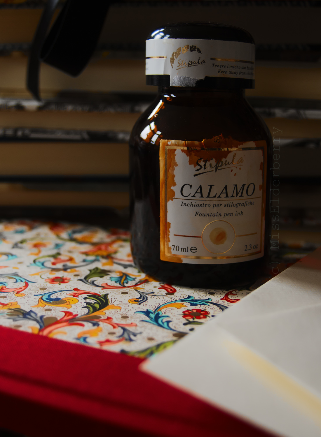 |
| Stipula Calamo Zafferano |
 |
| Iroshizuku tsuki-yo |
 |
| Octopus Burgunder (new style bottle) and Karamell |
Here's two bottles of ink by new German brand Octopus. I like the large, pharmacy-style bottle the most, it's more unique than the Pelikan-ish bottles also used by Kaweco and Standardgraph. As ink-pens.com pointed out recently, the bottles are similar but not quite the same!
 |
| Private Reserve Electric DC Blue and Montblanc Ink of Joy. |
Crystalizing ink can be annoying but I like the vividly colored sediments some orange inks leave at the bottle threads.
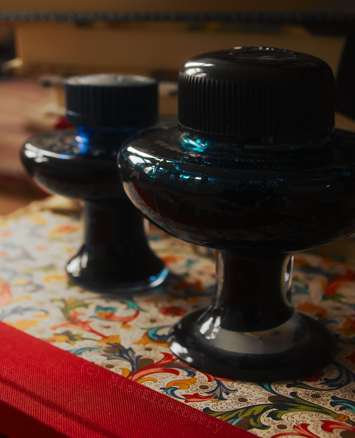 |
| Visconti blue (back) and aquamarine. |
Old style Visconti glass ink bottles...! Always make me fear they might topple over while filling a pen... but beautiful. The new plastic ones can't compare, also the blue in the glass bottle is much more vivid then the one in the plastic bottle which is a subtle blue-black. Those two have different sizes, the larger one being their Aquamarine turquoise.
(By the way, I think I love that Florentine pattern more every day. Gorgeous colors. I will show it up closer sometime.)
 |
| Octopus Karamell and Pinie |
... and some more Octopus bottles! Thanks again to Volker & Christiane for their gift.
Do you recognize the pen in front of them?
Besides: Wishing everyone a very happy New Year full of luck, happiness and good health! Posted by MissElderberry at 5:01 PM
Saturday, December 21, 2013
Stipula for Mercury: Francois des Trixhes
Christmas is almost here and between last minute shopping and cleaning the house before our usual holiday journey to one of our parents's homes I've got something special to show: a Stipula for Mercury "Francois de Trixhes" fountain pen in gorgeous grey and blue celluloid. As far as I know it's about 15 years old.
 |
| Stipula for Mercury "Francois des Trixhes" |
The pen is imprinted "Mercury, Francois de Trixhes" and was limited to 80 pieces. According to Regina Martini, who I bought this from, Stipula manufactured these as well as the "Impero" edition for Tibaldi - which would explain why it's the same celluloid. It's amazing! I've never seen a color like this before, the vivid blue veins are striking, like a black and white picture slowly disintegrating and color bursting through the cracks.


Also this was the first pen where I could actually smell the camphor note of the celluloid by sniffing the cap (though after I knew what to look for I also succeeded in detecting the same smell with some Omas pens). The pen is fitted with a rhodium plated Stipula italic which could be somewhat wetter but is nicely soft.
Sadly I have no idea who Francois des Trixhes is which makes me feel somewhat inadequate but can't be helped as google doesn't seem to know him either. Any ideas, anyone?

As is to be expected, the pen is very lightweight (25 g capped, 17 g uncapped) but not overly slim so it sits nicely in your hand. It's filled with converter or cartridges. Once I get the nib to write as I'd like it to I might add a writing sample.
Tom Westerich is selling a Goldfink button filler which he made of this same celluloid so he still seems to have some of it. It looks great and I don't have a button filler yet so I'm severely tempted - the price helps me resist though! Posted by MissElderberry at 8:17 AM
Friday, December 13, 2013
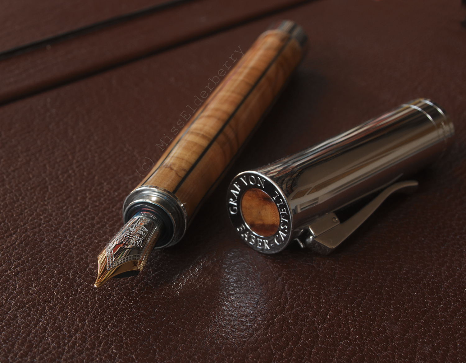
Olive Wood! Graf von Faber-Castell Elemento
I've loved the Elemento since it came out 2 years ago. Lately those have been offered with discounts at some places so I decided time was finally ripe to get one!
 |
| Graf von Faber-Castell Elemento |
The Elemento introduced their "Intuition: Wood" model which is now also available in Grenadilla, Ebony and Permambucco. The Elemento is a unique edition made of olive wood. You can see the fine grain and every pore of the wood.
The wood also has a special property which is called "Stirnholz" in German and I couldn't really find a translation for - one site offered "end grained wood" but I'm not sure if it's an accurate translation. Imagine cutting a tree into discs instead of logs. It's the same wood but the discs will look different and will also be harder. That's the way the wood was cut for the Elemento pens.
 The barrel is heavily lacquered so discoloration and staining can be avoided. You can probaly write with this one as long as you want, the grip section won't become darker or dirty. On the other hand, due to the treatment it doesn't feel as much like wood. I guess you can't have everything!
Their Grenadilla and Permambucco pens are not as heavily treated so you might want to look at them if you're after a wooden pen with a wooden grip section.
The pen is filled with cartridge or converter. By operating the knob at the back end the nib unit will be released from the barrel, not unlike the system Waterman used in their Serenité pens. If you use the converter, it is recommended to wipe the nib unit clean before inserting it back into the pen.
 Did you notice that the grip section is slightly tapered? It feels extremely comfortable. Also my fingers don't seem to slide towards the edge as they tend to with some pens but stay just where they belong. The Elemento is a medium sized (ca. 13 cm capped, 12,5 cm uncapped) and lightweight pen with 41g capped but only 21g uncapped. (Their Intuition Wood pens are noticeably heavier) The cap can be posted which feels quite comfortable - even to me who hardly ever posts the cap. Especially next to their Pens of the Year the Elemento looks tiny but it has a nice girth and doesn't feel too short by any means.
 |
| Graf von Faber-Castell Elemento: round tipped B nib |

Even the cap has a beautiful inlay of olive wood. The stripes of wood running down the barrel are chosen to be similar in color and grain, giving the whole pen a harmonious appearance.
On Graf von Faber-Castell's ads the wood looks very yellowish but mine has more of a red undertone. I guess each one is a little different.
How do you like this one? Posted by MissElderberry at 3:20 PM
Wednesday, December 4, 2013
Ink Twins: Diamine Twilight + Rohrer & Klingner Verdigris
One day I noticed I'd like to organize my ink collection outside of my head: Make some writing samples for each color, preferably with different plens, plus a few notes how the ink performed in the pen and maybe a swab. Sorted by color so it would be easy to find a specific shade if I ever looked for one. I started out immediately using a softcover notebook. Then I realized a notebook wouldn't be the best choice and something more modular would probably be better - so I chose index cards. Their heavier cardstock would also handle the swabs better. I've made about 30 sample cards so far, always with the inks I'm using at the moment, and already found ink twins! Diamine Twilight and Rohrer & Klingner Verdigris look somewhat different while the ink is still wet but when dried they're hardly discernible at all. They're a nice dusky blue-green color.
 |
| Swabs: Diamine Twilight (top) and Rohrer & Klingner Verdigris (bottom) |
Then I wrote a few lines of text, changing pens every few words. If it weren't for the fact that one pen has an italic nib and the other one a round medium I couldn't make out any difference at all.
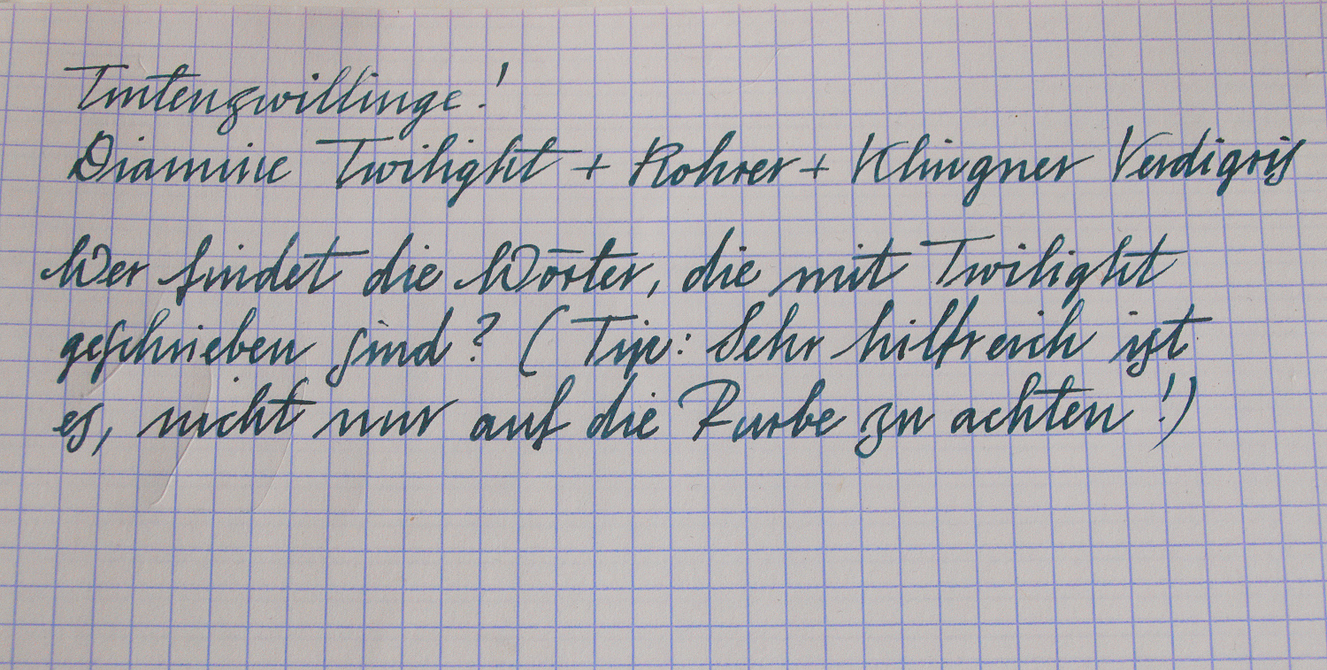
Could you?
In English it reads:
"Who can find the words written with Twilight? (Hint: It's extremely helpful not to look for color difference alone!)"
Both inks behave and flow quite well but the Rohrer & Klingner is the better deal for € 3,95/50 ml.
Do you know of any more ink twins?
Posted by MissElderberry at 6:32 PM
Sunday, December 1, 2013
New Ink Maker: Octopus from Germany
It's a great thing having all this variety of ink colors to choose from. Wet ones, dry ones, shading ones and others, colorful ones and subtle ones - the range is large already. Is there anything we could want from a new ink maker?Yes, I think so! Especially this really great caramel brown, fittingly called "Karamell" from Octopus here in Germany. They have a huge web shop selling printer ink and toner and apparently one of their chemists thought he'd like to make some nice fountain pen inks too. They're offering a small range of colors at good prices, packed in the no nonsense Pelikan ink bottles.
 |
| Nakaya Piccolo with Octopus Karamell ink |
I've also got Red and Burgundy. So far I've tried red, which is a pretty bright and not very interesting color and didn't flow too well in my Lamy 2000. The Karamell, however, is a different story. I love this shade of brown, it's quite light but easily readable, a little reddish but not too much and offers great shading. I compared it to Diamine Ochre, Ancient Copper and Montblanc Collodi and it's very different from all of them.
At first flow was very generous in my Nakaya Piccolo, then it dried up somewhat but still flows OK without any skipping.
I'll try it in some more pens as this is definitely a keeper ink! Will show the other colors as I test them.
The pen I'm using it in is a Nakaya Piccolo in yellow tame-nuri but fitted with a Platinum music nib as I no longer liked the soft fine nib the Nakaya came with and had the music nib around. As nibs and feeds were identical except for the imprints the exchange went fairly smoothly. (I've heard there's been a change of feed generations lately so this might not work if you have an old and a new model. Also music nibs have their own special feeds to supply both slits)
I have to say the Platinum nib looks great - I might even prefer it over the Nakaya ones looks wise.
The pen appears pretty dark in this picture so if you'd like to see some more of it look here: Nakaya Rainbow. It's the rightmost pen in the pictures. The color looks similar to shiro tame nuri but when held next to each other you can see that the base color is indeed yellow instead of white. Posted by MissElderberry at 10:44 AM
Thursday, November 28, 2013
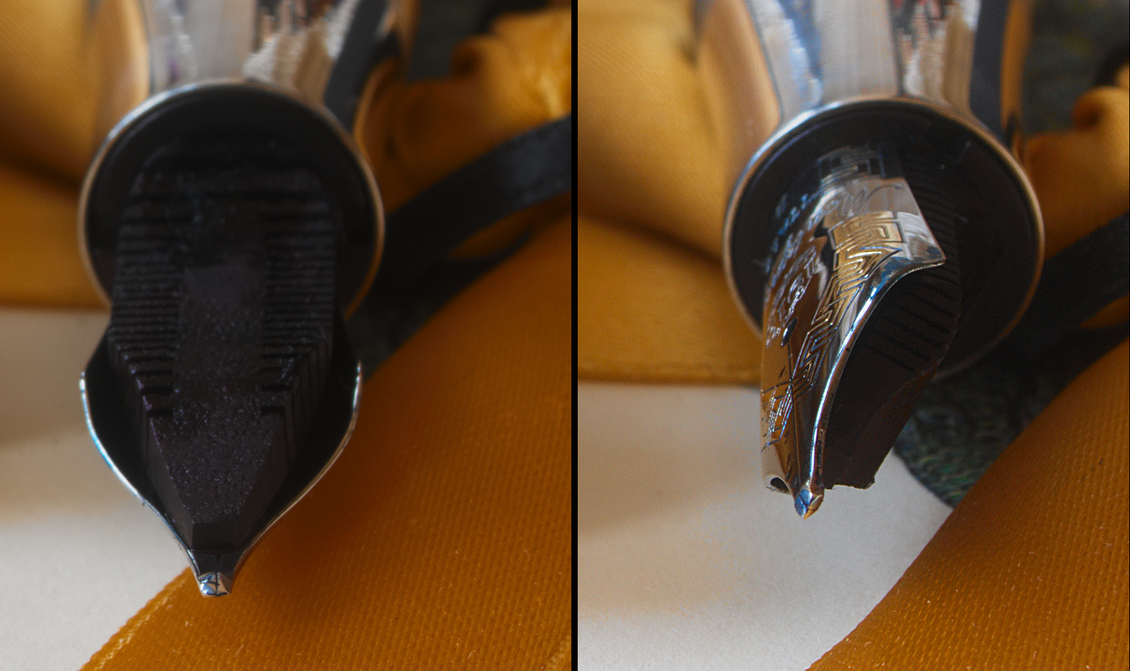
Another Italic Nib: Reground Montegrappa Extra
Some pens are just great all over. They are exactly the right size, girth and weight and they look beautiful too. But there's something, a small yet important detail, that makes you grab another pen instead. Time after time. Sometimes this detail is the nib, as was the case with this beautiful Montegrappa Extra 1930 in dark green Bamboo celluloid. I'm absolutely fine with stubbish factory broad nibs as done by Montblanc but that one was not only round tipped but also somewhat finicky. It was a hard starter if I didn't use the wettest of inks and also would dry out quickly.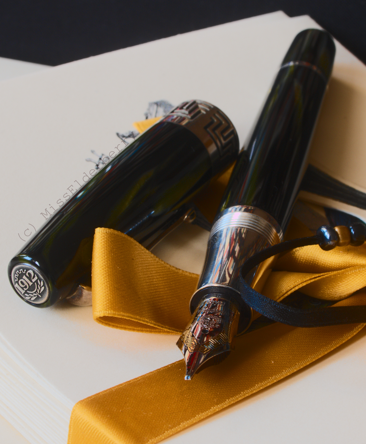
So when I heard that a fountain pen friend, Volker from "Pen Paradise", had started offering nib grinding service I decided this was the pen I would send to him. I've had quite a few nibs ground to italics or stubs in the past, most of them done by John Sorowka, and while I am still totally happy with his work it's a long journey to the UK for those pens every time.
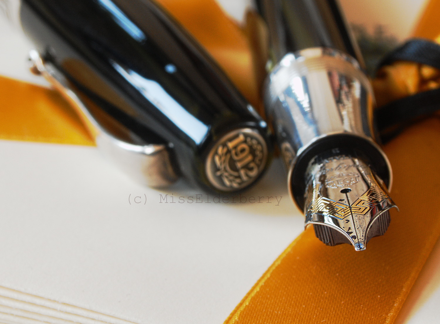
The beautiful Montegrappa arrived back with me quickly and even more beautiful than it went. Here's a view at the tip from a few angles. Also note the delicious sponge like ebonite feed, soaked with the fetching blue-green Rohrer & Klingner Verdigris.
So how does it write?
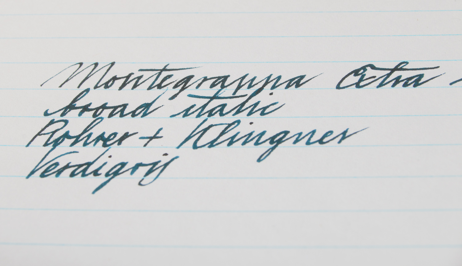
It's lovely! The color starts out a litte dark because I wrote these words right after taking the nib shots so the pen had been uncapped for quite a while.
The nib still feels as soft and smooth as it did before but minus the baby bottom issues. No reason why this one shouldn't get a lot more use from now on! Thanks, Volker.
Besides its great looks the Extra 1930 also is of beautiful size (about 15 cms) and weight with 39g capped and 29g uncapped.
Posted by MissElderberry at 5:44 PM